What does a t-SNE plot show?

You can find a t-SNE plot in almost every single-cell paper. But what are the dots, colors, and axes? This blog explains how you can interpret the plot.

Single-cell RNA sequencing datasets are huge. They usually contain the expression count of thousands of genes for thousands of single cells. One of the ways to visualize the data, which often shows up in scientific papers, is the t-SNE plot.

We wrote about what t-SNE means and how it works in a different blog. Without making it too complicated, you could say that the t-SNE algorithm can make a plot from a dataset that is otherwise unplottable. t-SNE aims to capture the similarities between cells in the original dataset by placing the cells close together on a two- or three-dimensional plot. The purpose of a t-SNE plot is to help the viewer see the underlying patterns in a single-cell RNA data set. Still, misunderstanding what these plots show can lead to misinterpretations.

In this blog, we aim to guide you through the main components of a t-SNE plot. When you look at the plot, what do you see?

Simply put, a t-SNE plot consists of three main elements: dots, colors, and axes.

2D t-SNE plot from single-cell data that shows seven clusters of cells
Image: example t-SNE plot from single-cell data

What are the dots on a t-SNE plot?

In single-cell RNA studies, every dot on a t-SNE plot represents a cell.

As explained above, the location of a cell on a t-SNE plot is determined by its similarity to other cells. Similar cells are placed together, while different cells are placed further apart.

Dots with short distances between them (so dots that form these island-like clusters) represent groups of cells with similar gene expression profiles. Cells within a cluster may have similar functions in a tissue: they may be the same cell type or react identically to treatment. Different cell groups may have different functions in a tissue or may be at diverging stages of development.

There's also information in the patterns within a cluster. Cells that lie on opposite sides of a cluster are usually more different than cells that lie closer to each other.

However, t-SNE is less stringent on placing cells far apart that are very different. This means that the distance between clusters is usually meaningless. So, you cannot conclude from a t-SNE plot that groups of cells that lay far apart are indeed cell types with very different gene expression profiles. An alternative algorithm called UMAP does this more strictly. That's why UMAP plots are often used in addition to t-SNE plots in single-cell research.

What are the colors on a t-SNE plot?

You can place different color labels over the data points in a t-SNE plot. In single-cell RNA studies, researchers most commonly color the cells by cell cluster, sequencing library, quality control metrics, or specific gene expression counts.
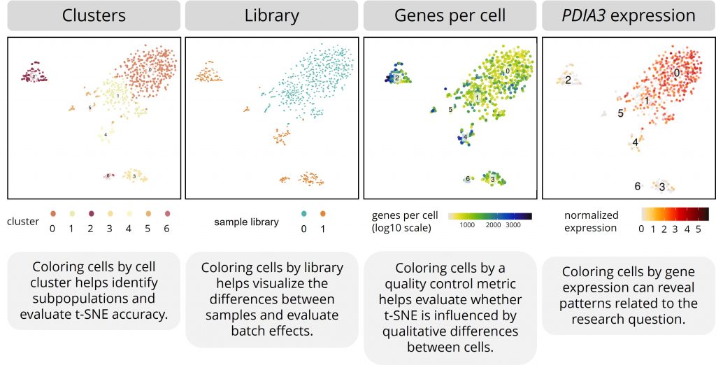
This table shows four iterations of the same t-SNE plot with different color labels. 1. Coloring cells by cell cluster helps identify subpopulations and evaluate t-SNE accuracy. 2. Coloring cells by library helps visualize the differences between samples and evaluate batch effects. 3. Coloring cells by a quality control metric helps evaluate whether t-SNE is influenced by qualitative differences between cells. 4. Coloring cells by gene expression can reveal patterns related to the research question.
Image: exemplary t-SNE plots with cells colored by cluster, sequencing library, the quality control metric ‘genes per cell’, and the gene expression pattern of gene PDIA3.

Cell clusters

Although t-SNE can visualize data to make clusters appear, most people use more accurate methods to define the cell clusters and subpopulations.

Placing color labels for the defined cell clusters over the t-SNE plot helps identify subpopulations more effectively and helps evaluate t-SNE’s accuracy.

Explore an example data report

See how we present our single-cell data analysis to clients including visualizations of cell clusters, differential gene expression profiles, and more.

Get our Exploratory report

Sequencing libraries

A sequencing library contains all the transcript data from a specific group of cells. In principle, a library is the result of one cell-capture plate (in SORT- and VASA-seq) or one microfluidic chip (in 10x Genomics). This usually corresponds with a (part of a) tissue or a sample from a specific patient or model system.

Coloring cells by sample library helps you visualize the differences between samples. For example, you can see if cells from different patients cluster together.

It can also be a useful way to evaluate batch effects. These are non-biological effects that can crop up during experiments and sequencing. When cells cluster too much by sample, t-SNE might have been hampered by non-biological variation between cells.

Quality control metrics

The quality of single-cell data can be assessed in different ways. The number of genes per cell, the number of unique molecular identifiers per cell, the percentage of mitochondrial genes, and the percentage of ribosomal genes can all say something about data quality.

Coloring cells by these metrics helps to evaluate whether t-SNE is influenced by qualitative differences between cells.

Gene expression

As a researcher, you’re often interested in how specific genes are expressed by different subpopulations. For example, plotting the expression of a cell type–specific gene over a t-SNE plot can show you which dots represent which cell types. For another example, plotting the expression of disease-related genes over a t-SNE plot can show you which subpopulations might be involved in the disease.

What are the axes on a t-SNE plot?

The axes of a t-SNE plot are not directly interpretable in single-cell research. It has no meaning for a biological interpretation to point to a cell and retrieve its value on the X and Y axis. It also doesn't say anything about the expression pattern in a group of cells if it's higher in a t-SNE plot or lower, more to the left or more to the right.

This is somewhat counterintuitive, as most people are used to plots with informative axes. As explained above, t-SNE reduces a high-dimensional dataset to a dataset with fewer dimensions so that it can show the cells on a 2D or 3D plot. So, cells’ distances from each other on a t-SNE plot are important, but their coordinates less so.

The axes are called t-SNE 1 and t-SNE 2 (plus t-SNE 3 in a 3D plot) because the plot shows the first two or three dimensions of the dataset reduced with t-SNE.

Examine an example

Study how a single-cell database is represented in t-SNE plots, UMAP plots, differential gene expression heatmaps, volcano plots, and more by downloading an example exploratory data analysis report from our archives.

Download


Learn more