
t-SNE is one of the most recognizable figures in a single-cell paper. What is it? What is its purpose? And how does it work?
As a researcher, you can get a treasure trove of information thanks to single-cell RNA sequencing. But the amount of information can be a devil in disguise.
A typical single-cell RNA data table contains information for thousands of genes for thousands of single cells. It won’t work just to try and find a pattern by reading through these millions of data points. So data scientists have designed methods to help visualize the information in such a way that you can more easily find patterns in their data.
One of those methods is t-distributed stochastic neighbor embedding (t-SNE). It’s the most frequently used visualization method of single-cell data analysis and one of the most common plots in single-cell articles. t-SNE plots could become misleading when the ways of t-SNE are mysterious to you. So understanding how t-SNE plots work is invaluable for those who work on single-cell studies.
This blog gets you up to par on the ideas behind t-SNE plots that are important for single-cell RNA sequencing. It answers the following questions:
- What is t-SNE?
- What's the purpose of a t-SNE plot in single-cell research?
- How does the t-SNE algorithm work?
- What does the perplexity parameter do?
- What does the name t-SNE mean?
- Are there alternatives to t-SNE?

What is t-SNE?
t-SNE is an algorithm that takes a high-dimensional dataset (such as a single-cell RNA dataset) and reduces it to a low-dimensional plot that retains a lot of the original information.
The many dimensions of the original dataset are the thousands of gene expression counts per cell from a single-cell RNA sequencing experiment. This is reduced to a degree that each cell gets a location on a two or three-dimensional plot.
Its purpose in single-cell research
The goal of t-SNE in single-cell studies is to place similar cells together and different cells further apart on a 2D or 3D plot. In the end, the distances between cells in the 2D or 3D plot aim to capture the differences between cells in high-dimensional space. This way, it helps to get a visual understanding of underlying patterns in single-cell RNA data.
How does the t-SNE algorithm work?
Broadly speaking, the t-SNE algorithm learns the underlying manifold, or shape, of a high-dimensional dataset in order to place similar cells together in a low-dimensional plot.
The t-SNE algorithm works in two stages:
Stage 1: high-dimensional space
- The algorithm determines the similarities between cells in the original, high-dimensional dataset.
Stage 2: low-dimensional plot
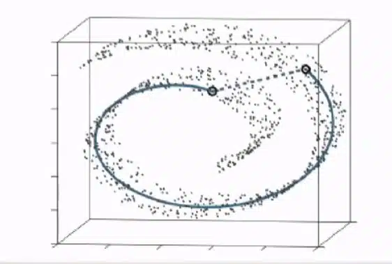
- The algorithm projects the cells as points on a low-dimensional plot. This is done by a random process. Importantly, this means that every t-SNE plot will turn out slightly different.
- It then determines the similarities between points in the low-dimensional dataset.
- Finally, it moves the randomly projected points around step by step, until the similarities between points in the low-dimensional dataset resemble the similarities between cells in the original dataset. You can see this part of the stage in action in a GIF made by Google Research.

Defining t-SNE’s most important parameter
The most important parameter of t-SNE is perplexity. It controls how many cells a cell is compared with during analysis. In some datasets, the chosen perplexity can have an effect on what the t-SNE plot eventually looks like. A usual perplexity lies between 5–50. Its effect depends on the underlying pattern in the data, which as a researcher you usually don’t know, so it’s recommended to try several different perplexities to see what suits a particular dataset.

What does the name t-SNE mean?
t-SNE stands for t-distributed stochastic neighbor embedding. It can be dissected most clearly from right to left.
- Embedding is a term used for reducing the dimensions of a dataset, in this case from many dimensions (gene expression counts) to two or three dimensions.
- Neighbor embedding focuses on the gene expression similarities between cells. As explained above, t-SNE focuses on local structures. You could say that it focuses on the ‘neighborhood’ of a data point. Its goal, if you will, is to give a data point the same neighbors (i.e., similar cells) in a low-dimensional plot as it had in high-dimensional space.
- Stochastic is an interchangeable term with ‘random’. It points toward the random process by which the algorithm projects the cells as points on a low-dimensional plot in stage 2 of the algorithm. As said before, every iteration of a t-SNE plot can be different because of this stochastic step in the algorithm.
- t-distributed refers to the mathematical approach to determining the similarities between points in the low-dimensional dataset. It namely uses the statistical method of Students’ t-distribution for this purpose.
Are there alternatives to t-SNE?
The most frequently used alternative to t-SNE is UMAP, uniform manifold approximation and projection. It was published ten years after t-SNE and has quickly become as common a plot in single-cell papers as t-SNE.
Like t-SNE, the UMAP algorithm first learns the original dataset’s manifold to calculate cell similarities. Then it aims at capturing those similarities in a low-dimensional plot, similar to t-SNE. It differs mainly in the mathematical approach to building that low-dimensional plot. Broadly speaking, t-SNE is a more accurate visualization of similar cells, while UMAP more accurately represents the distances between cell clusters.
Read in this blog what UMAP exactly is.
Concluding remarks
t-SNE is a smart algorithm that can plot out a dataset that would otherwise be too complex to plot. All the while, it can do so without losing most of the information on the patterns in a dataset.
Ready to analyze your own single-cell data? Then first read this blog on how to get started.
If you want to dig deeper into the mechanisms of the algorithm or start working on an example, we can recommend the following papers and web pages.
Now that you know what it is and how it works, it's time to analyze what a t-SNE plot shows.