Umap interpretation - How does the UMAP algorithm work?
Broadly speaking, the UMAP algorithm learns the underlying manifold, or shape, of a high-dimensional dataset to place similar cells together in a low-dimensional plot. If you know how t-SNE works, you'll find UMAP to be very similar in its essentials.
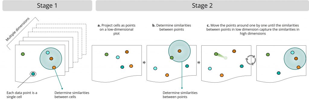
The UMAP algorithm works in two stages:
Stage 1: High-dimensional space
- The UMAP algorithm determines the similarities between cells in the original, high-dimensional dataset.
Stage 2: Low-dimensional plot
- The UMAP algorithm projects the cells as points on a low-dimensional plot
- The UMAP algorithm then determines the similarities between points in the low-dimensional dataset
- Finally, it moves the projected points around step by step until the similarities between points in the low-dimensional dataset resemble the similarities between cells in the original dataset. It forces one to a couple of points each time, which helps it scale well with extra-large datasets. This step includes a random component, so every time you make a UMAP of the same dataset, it can look slightly different.
Defining the most essential UMAP parameter
There is an important user-defined parameter at UMAP stage 1 (when determining the similarities between cells in the high-dimensional dataset). This is the number of neighbors. It controls how many neighboring cells the UMAP algorithm compares each cell with. This effectively changes the balance UMAP holds between local structure and global structure.
Changing the number of neighbors affects how you visualize large single-cell datasets. Generally speaking, a relatively low number of neighbors results in small, more separated clusters. With low numbers of neighbors, UMAP tips the balance more to local structure. In contrast, a relatively high number of neighbors causes UMAP to focus more on retaining the global structure of the data. The result can be that you can start to see a global pattern in the data—for example, the development pathway of a group of cells.
It’s always worthwhile to try different values for the number of neighbors to see what gives the most biologically meaningful result with a particular dataset.
What does the name UMAP mean?
UMAP stands for Uniform Manifold Approximation and Projection. You can dissect it as follows:
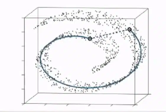
- Uniform refers to a mathematical assumption UMAP uses. It assumes that all data points distribute evenly across the manifold. In reality, this is almost never the case. So, the consequence of this assumption is that the points are uniformly distributed, but the space between the points is artificially warped. Hence, the distance across the manifold varies. UMAP uses this distance to calculate the similarities between cells.
- Manifold means the shape of the data points. UMAP learns that shape to determine the similarities between cells.
- Approximation refers to the fact that the algorithm should approximate the data’s manifold, or shape, to determine similarities between cells.
- Projection happens after the cells’ similarities are determined. UMAP projects the cells as points on a 2D or 3D plot. Then, it moves the points around until the 2D or 3D plot captures the similarities of the high-dimensional data.
UMAP vs. t-SNE: which is better?
How the algorithms compare
The UMAP and t-SNE algorithms are seen as very similar. Both are manifold-learning algorithms. Both have a stochastic step. For single-cell RNA sequencing data, both try to reduce the dimensionality of the data by calculating the similarities between cells. Both then optimize a low-dimensional graph that captures those similarities. However, UMAP relies on several mathematical insights that give it a more solid footing and accelerate its calculations. This makes UMAP scale better with bigger datasets.
To dive deep into the math differences between both methods, read this blog.
How the results compare
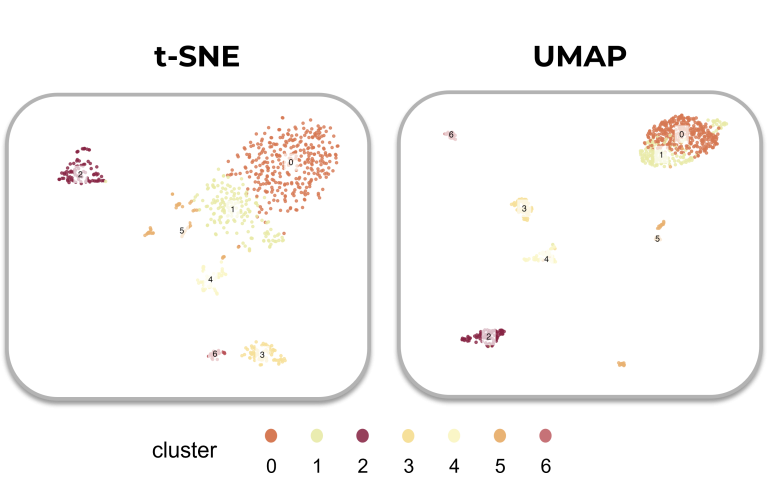
Compared to t-SNE, UMAP is usually more accurate in preserving the global structure of the data. Both algorithms can accurately group similar cells together, yet UMAP better tracks how much these groups differ from each other.
This means that the global positions of cell clusters are potentially more meaningful in UMAP (if used correctly) than in t-SNE plots. On the other hand, local differences are potentially better preserved on a t-SNE plot (if used correctly).
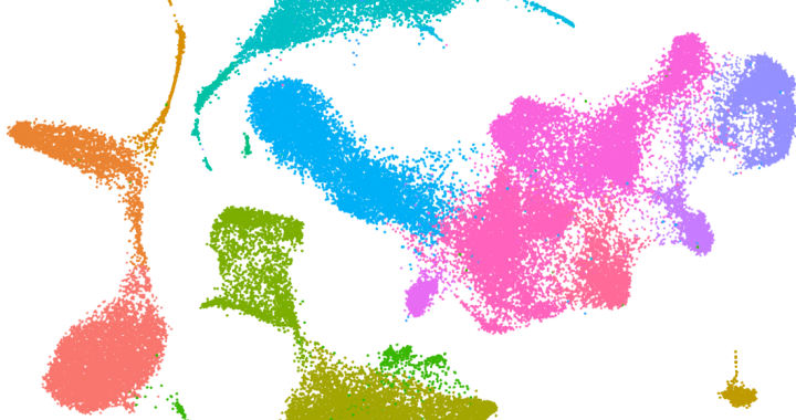
We always deliver single-cel sequencing data in UMAP and tSNE plots. See how they compare in a real-world example in our data report
Which is better: UMAP or t-SNE?
We believe that choosing UMAP over t-SNE, or vice versa, depends on the research question, the nature of the data, and the researcher’s preference. The best tool is the one most suited for the task at hand.
Also, you may need more than one plot. The best practice is to visualize your data with both methods, run both methods with various parameters, and run them more than once with the same parameters to detect the effect of randomness on the results. All the while scrutinizing the results from a biological perspective: does the plot still make sense? Ask what hypotheses you can construct from the visualization, then rigorously test those hypotheses with experiments.
Further reading
With the online paper Understanding UMAP, you can practice and interactively learn how UMAP behaves with simple examples.
If you want to dig deeper into the mechanisms of UMAP or start working on an example, we can recommend the following papers and web pages.
- Get to know the mathematical ideas behind UMAP with this tutorial video.
- UMAP was first published by Leland McInnes, John Healy, and James Melville in 2018. You can read the original paper on ArXiv. You can find a GitHub collection page for all stuff UMAP hosted by McInnes here.
- To apply UMAP on single-cell data, you can follow the guided clustering tutorial with Seurat for the R programming language or this tutorial on creating UMAP plots for Python.
PREVIOUS: WHAT DOES A TSNE BLOG SHOW? Next: How We Identify a Cell
Get a single-cell data report