Cell type identification is currently one of the leading applications of single-cell RNA sequencing experiments. How do we do it? In this blog, we zoom in on the nine-step process that takes you from raw sequencing data to assigning cell type labels.
Knowing what cells are present in your sample can serve many a purpose. Your goal might be to create a single-cell atlas of a heterogeneous tissue. Perhaps you want to characterize an immune response to a pathological condition. Or you may be aiming to understand a tissue’s multifaceted reaction to therapy.
Researchers use single-cell RNA sequencing (scRNA-seq) for cell type identification in all these cases and more.
To accurately identify cell types and reveal the underlying biology, data generated by scRNA-seq needs to go through a series of processing steps. It’s important for anyone employing scRNA-seq in their research that they understand this process.
Hence, in this article, we will discuss the nine steps typically used to translate scRNA-seq data into cell type identity labels. You will learn which considerations we make in each step and what our clients can expect from our services.
Chapters
- Introduction to scRNA-seq data
- Step 1: Data mapping
- Step 2: Expression level quantification
- Step 3: Quality control and filtering
- Step 4: Determining valuable features
- Step 5: Principal Component Analysis
- Step 6: Clustering
- Step 7: Differential gene expression analysis
- Step 8: Data visualization
- Step 9: Assigning cell type identity
- Incorporating helpful extra data
- Summary
A short introduction
to scRNA-seq data
It’s best to first share some basic scRNA-seq data info before we dive into the processing steps.
Whether your technology of choice is the high-throughput 10x Genomics platform, the plate-based SORT-seq platform, or another technology, raw scRNA-seq data consist of sequencing reads. A read corresponds to a part of an mRNA sequence amplified from your sample.
We can assign reads to their cell of origin with the clever integration of a cell-specific barcode in every read. You can find more info on the fundamentals of scRNA-seq in our ultimate guide.
Moreover, we can trace back how many transcripts of each individual mRNA were present in each cell with another smart barcode called a unique molecular identifier (UMI). You can read more about that process in this blog. What’s important for the purpose of this article is the following:
Reads with the same UMI originate from the same mRNA transcript. These are technical duplicates amplified during library preparation. We count these as a single read.
Reads with the same mRNA sequence but different UMIs originate from biological duplicates, meaning multiple molecules of the same mRNA were present in the cell. These, we count as individual reads.

Step 1: Data mapping
The first step in analyzing scRNA-seq data is to map the sequencing reads to the reference genome or transcriptome. This step is necessary to identify which genes are expressed in each cell and to quantify the expression levels. It labels every mRNA transcript with its gene name.
There are several algorithms available for this step. We use the mapping method named STAR. STAR is a relatively data-rich mapping protocol that also presents information about spliced and unspliced mRNA transcripts.
Many species have their own established reference genome. You can find a list of the genomes we currently use on this support page.
Sometimes, researchers expect reads from mRNAs that aren’t in the reference genome. For example, genetically modified mouse liver cells may express fluorescent GFP. We can add the sequence of such transgenes to the reference genome prior to mapping. Then we can find the transcripts back in the single-cell data.
Or, a sample from xenograft zebrafish with human tumor tissue can contain mRNAs from both organisms. We can then combinatorically map to all relevant genomes and find back the relevant transcripts.
Step 2: Expression level quantification
Once the sequencing reads have been mapped to the reference genome, the next step in cell type identification is quantifying the gene expression levels. This step involves counting the number of sequencing reads that align to each gene. As explained in step 1, you need the cell-specific barcode and UMI to do this correctly.
The result is a count table. It contains the counts for all genes in every processed cell. This means that, in theory, if a gene is not expressed, the count here would be zero. If ten mRNA transcripts from gene A were present in the cell at the moment of processing, the count would be ten. And so on for all transcripts. Of course, in reality, the accuracy of such biological assays is not perfect.
As you may expect, these tables are often massive. Hundreds to thousands of single cells can make up this table’s columns (even millions in some cases). In the rows, there’s the count of thousands of genes for every cell. Humans, for example, have 20,000 to 25,000 genes, while rice has more than 30,000. So the amount of data points in a count table can range from 105 to 1011 or more. Hence, it requires some data processing before the scRNA-seq results can lead to biological insights.
Step 3: Quality control and filtering
But first, we need to supervise the data quality. After gene expression counts are obtained, we apply quality control and filtering steps to the data. This includes removing low-quality cells that do not meet specific criteria, such as a minimum number of detected genes or a high percentage of mitochondrial genes.
We include preliminary data analysis in all our services and perform quality control and filtering with default parameters. However, it depends on the sample or tissue what would define a good-quality cell. And filtering often requires manual adjustments.
In some tissues, standard filtering can be too stringent. For example, (naïve) T cells naturally have low transcript numbers per cell and would otherwise be filtered out. Or take cardiomyocytes, whose metabolic activity means a high ratio of mitochondrial genes, typically a sign of low quality. A pooled sample of wild type and tumor cells also demands scrutiny. When a cell shows a lot of mitochondrial genes, does this indicate a low-quality cell or a metabolically active tumor cell? This might require a second filtering metric.

Hence, for cell type identification in our custom data projects, we aim to balance between more and less informative results. We do this together with our clients and based on biological insights. In all projects, we provide helpful reporting if you plan to do the data analysis.
We then perform scaling. It means we correct the relative gene expression abundances between cells by a linear transformation. We scale the gene counts to have 0 ‘mean expression’ and 1 ‘variance’ across cells. This improves the comparison between genes and prevents highly expressed genes from dominating the analysis.
Step 4: Determining valuable features
Once the data has been filtered and cleaned, the next step in cell type identification is to determine the valuable features of the cells.
By default, we perform this step in an unbiased manner. The most variable genes are then selected by applying variance-stabilizing transformation. This statistical tool selects the genes with the highest variance-to-mean ratio. Typically, we use the 2,000 most variable genes for further analysis. These are the genes that show the largest expression differences between cells.
It’s possible to customize this process. For example, you can add a gene of interest to the list of variable features and join that in with the data analysis. Or, it might make biological sense to exclude all cell cycle, mitochondrial, or T cell receptor genes. Such biased selection can be fitting in the context of your research questions or sample type.
Step 5: Principal component analysis
Principal component analysis (PCA) is a dimensionality reduction method helpful in identifying patterns in large datasets.
Using the 2,000 most variable genes of step 4., PCA creates principal components. These are a kind of ‘meta feature’ that captures the variation between cells. This compresses the data, and some data is lost in the process. Still, the most important information (i.e., how different and similar cells are) is retained in the principal components.
We select the most informative ones for clustering and visualization. This is usually anywhere between 10 and 30 components.
In our preliminary data analysis, this is done with an automated process. Hence, we recommend more refined testing of different numbers of principal components yourself. In our custom data projects, we analyze the clustering results together with the clients to see if the principal component selection needs adjusting. If so, we do a rerun and reanalyze the results. This methodical process relies mostly on our experience and goes hand in hand with input from the biological expert. In any case, both reducing or increasing the number of principal components could help.

Step 6: Clustering
After we have identified the relevant principal components, the next step in cell type identification is to cluster the cells. This step is usually done using unsupervised clustering methods, such as k-means or hierarchical clustering. We perform graph-based k-means clustering, sometimes called shared nearest neighbor (SNN). You can find a step-by-step coding tutorial here.
The important parameters are the number of principal components (which we touched upon before), the number of neighbors (the k parameter), and the resolution parameter.
The k-parameter is the number of similar cells that each cell is compared with during clustering. A higher k means that more neighboring cells are checked. We roughly align this number with the expected cluster sizes and let data visualizations (UMAP and t-SNE, see step 8) inform our choices.
The resolution parameter affects the ultimate amount of clusters. Higher resolution usually means more clusters, while lower resolution means fewer clusters. Testing various resolutions shows the clustering stability and informs about the cluster’s biological meaningfulness. Like the k-parameter, resolution can change depending on the cell count. For example, a resolution between 0.2 and 1.4 usually returns good results for a typical dataset of around 3,000 cells. However, this is dependent on the set k-parameter.
In our custom data projects, we generally send various sets for comparison to the biological expert, our client. By communicating transparently and clearly, we aim for optimally informed clustering results.

Step 7: Differential gene expression analysis
Once the cells have been clustered, the next step is to evaluate differential gene expression between the clusters. We analyze how the gene expression profile of cells in one cluster is different from the other cells.
Genes differentially expressed in each cluster help identify the biology driving the identified cell clusters. Differential gene expression analysis could, for example, highlight individual marker genes that typify a cell subset. Many cells have such marker genes. For example, CD45 expression identifies blood cells.
To give a more complex example, differential gene expression analysis could highlight a panel of multiple differentially expressed genes that together typify a cell subset. However, cell type identification based on single markers is highly dependent on the experimental context. We explain this procedure in more detail in step 9.
Since gene expression analysis is relative, it matters whether you compare a cluster with another cluster, all other clusters, or all other cells. We calculate which genes show significantly high expression in a cluster relative to the other clusters.
Step 8: Data visualization
Visualizing cell clusters
We visualize cell clusters in 2D with UMAP and t-SNE plots, the two most familiar plots for single-cell researchers. The principal components we selected in step 5 serve as input for these visualization methods. We describe how to read and use such plots here. And we explain more about how to use t-SNE and UMAP here and here, respectively.
UMAP and t-SNE can also be useful to direct the earlier steps in the process laid out in this article. For example, overlaying quality control metrics on a UMAP or tSNE plot can inform decisions made in quality control. Or, by coloring the cells per sample batch, they can indicate whether batch effects are distorting the clustering (see this article).
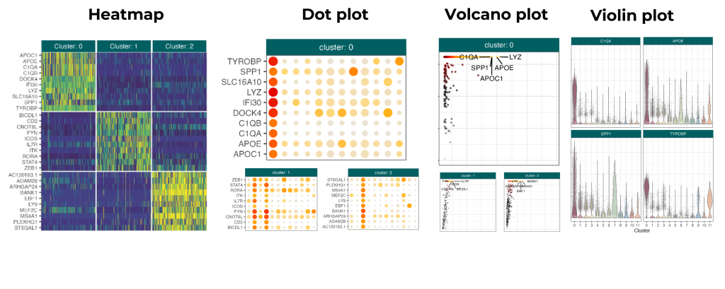
Visualizing differentially expressed genes
You can use UMAP and t-SNE plots to visualize differentially expressed genes. Namely, you can overlay the cells in such a plot with a color gradient that indicates the gene expression levels. Other ways to visualize gene expression are with heatmaps, dot plots, volcano plots, and violin plots, as shown in the figure below.
All of these plots can help you understand the validity and meaning of differentially expressed genes in your clusters. That’s a crucial stepping stone to successful cell type identification.
Step 9: Assigning cell type identity
The final step is to assign cell type identity labels to each cluster. Arguably, this is the most difficult step: interpret your data in the biological context.
In different contexts, the practical steps of cell type identification vary. Here, we touch upon the process in two settings: identifying established cell types and identifying novel cell types.
Established cell types
Identification of established cell types is the most straightforward and involves comparing the gene expression profiles of the clusters to established cell types or using (supervised) machine-learning methods to predict the cell type. Some cell types have distinct marker genes. For example, differentially expressed PFN1 may mark an osteocyte.
Other cell types have been firmly associated with a more complex yet distinct gene expression profile. In these cases, a statistical comparison between the discovered profile and the database can assign a cell type. We can perform this so-called gene set enrichment analysis to unearth cell types by their gene profiles.
Novel cell types
There’s always the possibility of discovering a new cell type. Differential gene expression analysis can reveal interesting aspects of a novel cell type’s physiology and phenotype. Researchers can then explore the cell’s physiology with additional functional or genetic testing in order to validate the characteristics of the cell type.
Assigning cell type labels is not included in our preliminary data analysis. In our custom data projects, we always collaborate with our clients to synergize our RNA-sequencing data expertise with their biological knowledge.
Learn more about assigning cell type identity in disease and developmental stages in the article How We Tackle Cell Type Annotation.
Incorporating helpful extra data
Besides scRNA-seq analysis, various technologies exist to analyze individual cells. Examples are single-cell genomics, single-cell proteomics, single-cell chromatin accessibility assays, and single-cell lipidomics. These technologies can be combined into a single-cell multiomic experiment, which could potentially improve cell type identification.
CITE-seq
Some cell types have distinctive features that are difficult to find back in the transcriptome data. One example is T cells. CD8 is a membrane protein that characterizes a type of T cell, namely the CD8+ cytotoxic T cell. In this context, cell-surface proteome analysis (CITE-seq) can overcome scRNA-seq’s limitation. For most research questions, however, scRNA-seq plus functional validation suffices for cell type identification purposes.

Spatial transcriptomics
Spatial transcriptomics combines transcriptomic data with information about the location of (groups of) cells. As such, you can visualize gene expression data per region. This could aid in cell type identification because it brings location data to the table. For example, it could aid the identification of niche-specific cells such as B cells in lymph node niches.
In general, spatial transcriptomics provides an extra dimension to single-cell RNA data that has myriad possibilities. We explain more about spatial transcriptomics here, here, and here.
Summary
In this blog, we zoom in on the process of identifying cell types from raw single-cell sequencing data. We share some practical tips, examples, and insights with each of the nine steps.
We leverage a lot of our lessons from past experiences with single-cell data analysis and benefit greatly from data analysis optimizations. As we have experience with more than 30 tissue types and over 40 species, there’s a lot we’ve done before.
Ultimately, robust cell type identification also depends on the validity of the gene or gene set markers. For this, we leverage the biological expertise of our clients. And finally, it’s important to stress that the best practice is to follow up scRNA-seq experiments with validation experiments of another nature to further characterize the cells in your sample. Likewise, it is advisable to determine whether an identified cell type confers a stable cell type or a transient molecular state.
Need some extra support? Read more on our data analysis approach here or contact our data experts by mailing to data_consulting@scdiscoveries.com.