We include a preliminary data analysis report in all our services. Here, we explain how they work, what to expect from single-cell experiments, and our services.
Single-cell RNA sequencing returns data in quantities and complexities that can seem daunting for the average scientist. FASTQ files, BAM files, and gene count tables are the basis for data analysis. But they are not an accessible read and require relatively advanced programming before you can gauge data quality or view single-cell clusters. This can be made more user-friendly.
Hence, we deliver a preliminary data analysis report included in all our services. This report shows and explains to each client their data and our data analysis process. It provides a speedy QC check, immediate estimation of cell clusters, and a quick overview of preliminary gene expression patterns.
Our preliminary data analysis
For our preliminary data analysis, we perform preliminary cell filtering, clustering, and differential expression analysis using our custom data analysis pipeline. We also review the data and adjust parameters where needed.
Of course, more stringent analysis needs to be performed by the clients themselves, informed by their biological expertise and experience. Our preliminary data analysis results are not publication-ready.
But with our preliminary data analysis, we do provide an accessible data overview that helps clients quickly gauge their outcomes. Hence, you can immediately review the cell clusters and differential gene expression patterns revealed by preliminary analysis. And, because we clearly explain our process in the report, you can readily trace back which parameters to change to improve the analysis.
With this, we hope to help you hit the ground running with your own data analysis.
Example data analysis reports
So, what can you expect to find in a preliminary data report? Here, we share example preliminary data analysis reports for our 10x Genomics, SORT-seq, and VASA-seq services.
The data in the example reports represent a typical dataset for each of these services. They showcase analysis of data from high-quality, in-house R&D samples. If you click through them, you see how we will provide your data if you work with us.
Find out about the reports’ contents below.
Jump to:
Example 10x Genomics report
10x Genomics is our high-throughput single-cell sequencing service based on microfluidics. The example report showcases data from mouse lung and liver nuclei tissue. In the example report, you will find the following components:
- Preliminary analysis figures, which give a quick overview of the data with the following analyses:
- Filtering and QC. This shows the metrics, such as UMI per cell or mitochondrial genes per cell, by which cells are filtered.
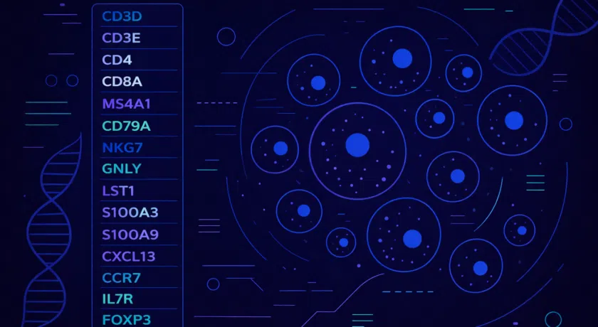
- Clustering. This shows the single-cell clusters after clustering analysis, in UMAP and tSNE plots, and with various informative labels.
- Differential expression. In various plot types, these figures show the genes differentially expressed in each cluster. This helps explain the biological processes driving the identified cell clusters and aids cell type identification.
- Next steps. Here, we outline the steps you can take to advance your data analysis.
In addition to our preliminary data report, 10x Genomics results include a summary HTML-file that also helps you to quickly understand the data.
*To give you the complete picture of the data you can expect, you can view the full reports. Because they are up to 50+ MB in size, the next page may take a minute to load.
Example SORT-seq report
SORT-seq is our single-cell transcriptomics technology based on FACS sorting and 384-well plates. The example report displays data from human peripheral blood mononuclear cells (PBMCs). In the example report, you will find the following components:
- Mapping and counting quality control figures. With various plots, we show gene mapping results such as gene body coverage, mapped reads, and genes per cell.
- Plate quality control figures. We visualize helpful metrics that give an indication of content quality per plate well. These include figures that show which metrics would signify low quality and which wells are consequently excluded from downstream analysis.
- Preliminary analysis figures, which provide a quick overview of the data with the following analyses:
- Filtering and QC. This shows the metrics, such as UMI per cell or mitochondrial genes per cell, by which cells are filtered.
- Clustering. This shows the single-cell clusters after clustering analysis, in UMAP and tSNE plots.
- Differential expression. In various plot types, these figures show the genes differentially expressed in each cluster. This helps explain the biological processes driving the identified cell clusters and aids cell type identification.
- Next steps. Here, we outline the steps you can take to advance your data analysis.
*To give you the complete picture of the data you can expect, you can view the full reports. Because they are up to 50+ MB in size, the next page may take a minute to load.
Example VASA-seq report
VASA-seq is our full-length, total RNA single-cell transcriptomics technology, also based on FACS sorting and 384-well plates. The example report displays data from human peripheral blood mononuclear cells (PBMCs). In the example report, you will find the following components:
- Mapping and counting quality control figures. With various plots, we show gene mapping results such as RNA biotypes, gene body coverage, and genes per cell.
- Plate quality control figures. We visualize helpful metrics that give an indication of content quality per plate well. These include figures that show which metrics would signify low quality and which wells are consequently excluded from downstream analysis.
- Preliminary analysis figures, which give a quick overview of the data with the following analyses:
- Filtering and QC. This shows the metrics, such as UMI per cell or mitochondrial genes per cell, by which cells are filtered.
- Clustering. This shows the single-cell clusters after clustering analysis, in UMAP and tSNE plots.
- Differential expression. In various plot types, these figures show the genes differentially expressed in each cluster. This helps explain the biological processes driving the identified cell clusters and aids cell type identification.
Next steps. Here, we outline the steps you can take to advance your data analysis.
*To give you the complete picture of the data you can expect, you can download the full reports. Because they are up to 50+ MB in size, the next page may take a minute to load.
Our data analysis
For our preliminary data analysis, we utilize custom Nextflow pipelines and review all data output. This approach allows us to adjust parameters if necessary before delivering the final data to you. Our dedicated data team ensures quick and comprehensive communication and is readily available to provide further information and answer any questions you may have.
In addition to the preliminary data reports, our data consultants can help you with optimizing the parameters and enhancing the experiment with advanced analyses in a custom data analysis project. Examples are batch effect corrections, clustering analysis to guide cell type identification and gene set enrichment analysis.
Learn more about our data analysis services on the data analysis page.